There are about 10 million colours that the human eye can see.
So, with so many options to choose from, how can you possibly narrow down a colour scheme for your home? If the selection is overwhelming, don’t worry. BOWERBIRD Interiors recently had the opportunity to create a collection of luxury display suites for our ONE The Waterfront. With so many different suites, they got to work with a number of colour schemes. Using photos from the project as examples, here’s how different colours can impact the aesthetic and mood of your home.
Light
Light neutral tones are the perfect blank canvas for any space – you really can’t go wrong. A white on white finish will instantly brighten up any room, making these tones particularly useful in spaces that feel dark and cold with not much exposure to natural light. A light look is airy and calm so match it with textures that will complement this like soft linens, cottons, and wools.
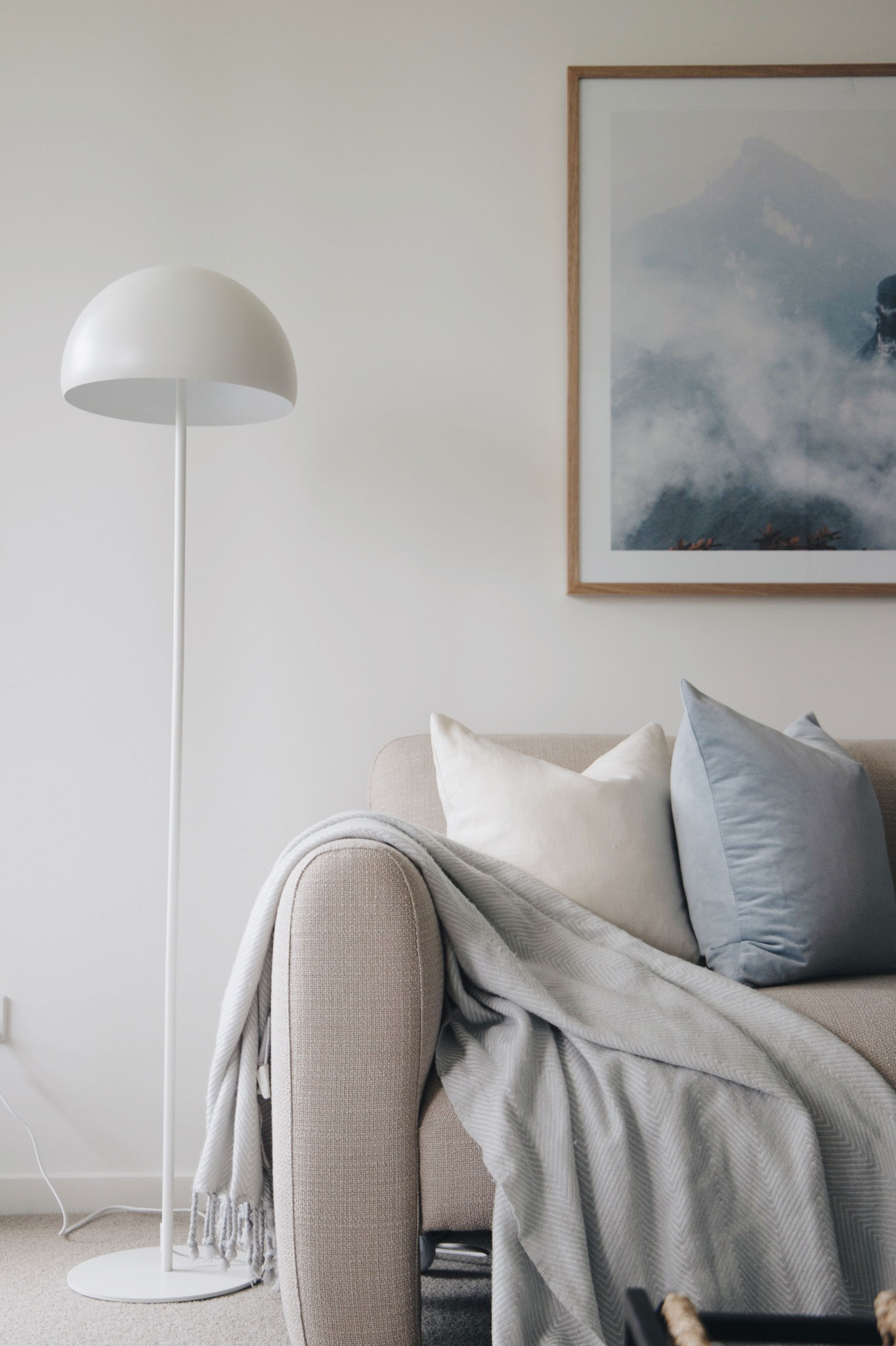
Cool
You might instantly be drawn to electric blue when you think of cool tones, but this is far from trendy right now. To incorporate cool tones into your interior you need to use it with a light touch. Think pastel blues in art, soft furnishings or even cabinetry. Even adding lots of glass finishes and greenery can enhance the cool vibe without looking “under the sea”. Soft blues pair perfectly with a brushed gold finish for a little contrast.
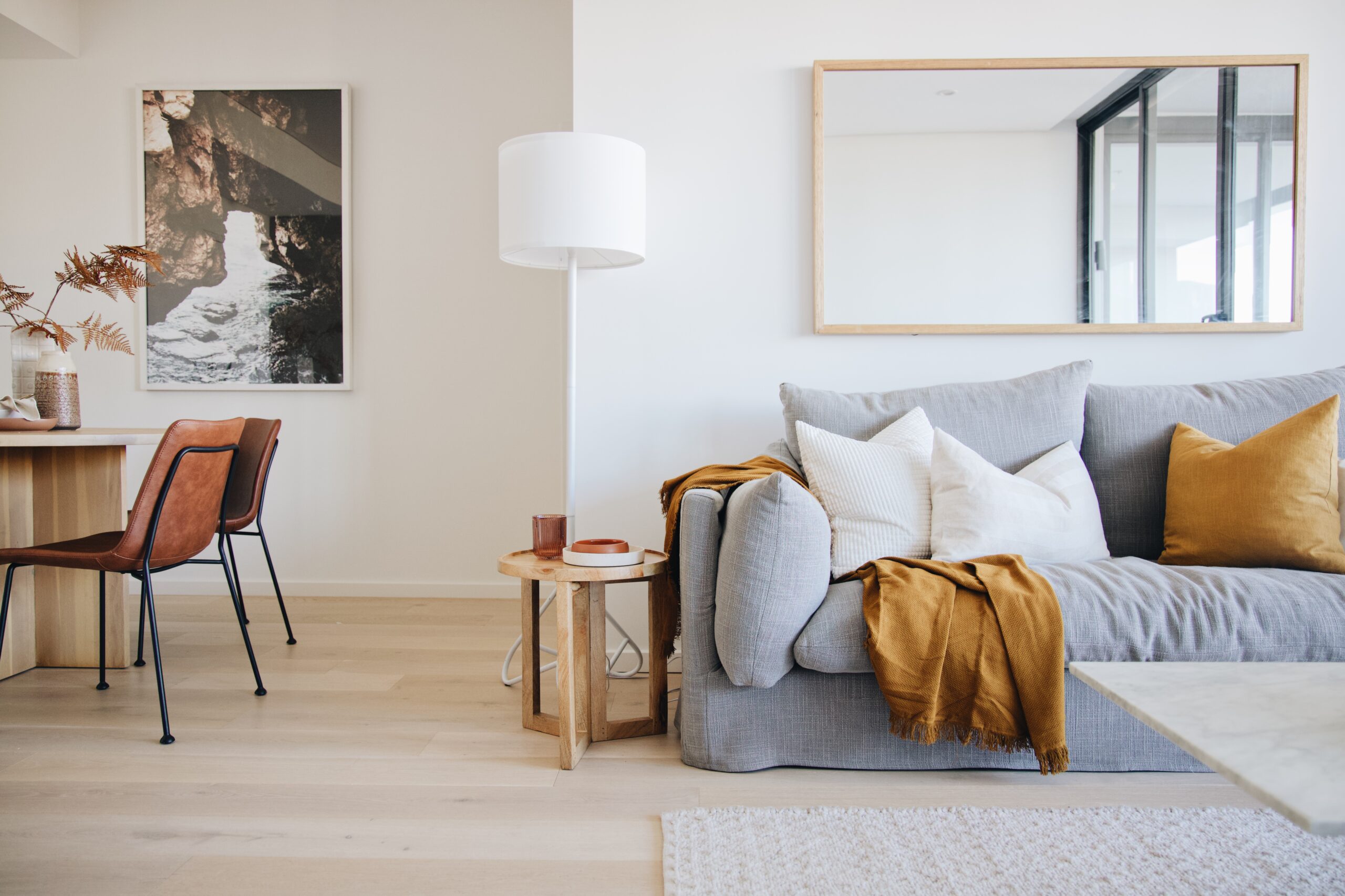
Warm
Vibrant oranges and yellows are definitely something to steer clear of when trying to incorporate warm tones into your home. A better way is to add an abundance of warm materials like timbers, rattan, wicker, terracotta, leather, and jute (just to name a few). This will give your space that cosy warm feeling without making it polarising. Or, add pops of muted warm colours, such as a burgundy or mustard velvet cushion.
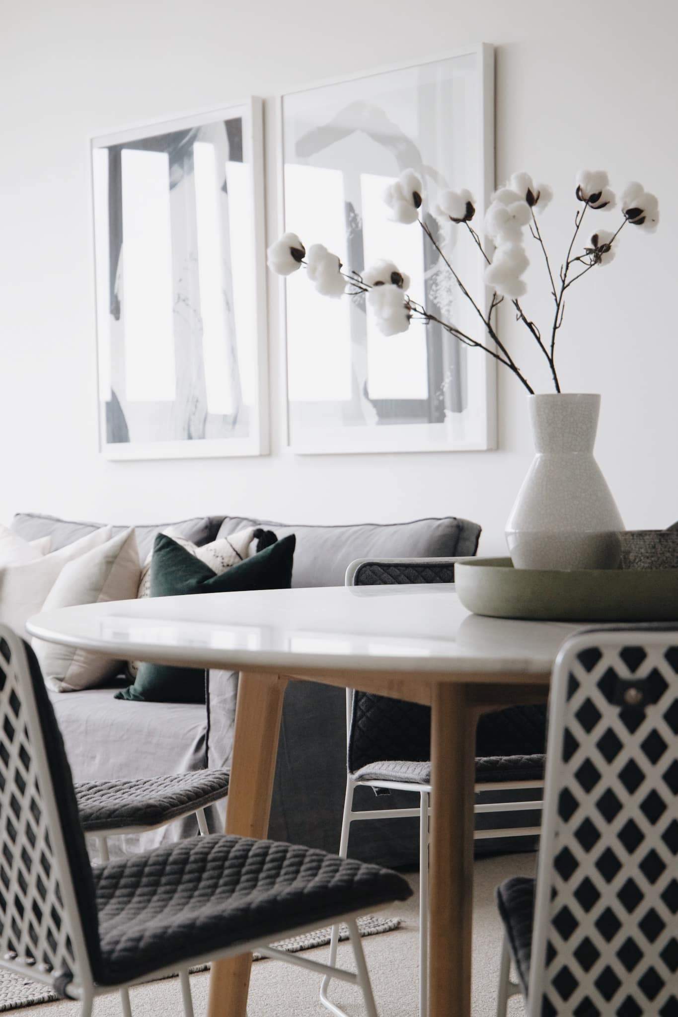
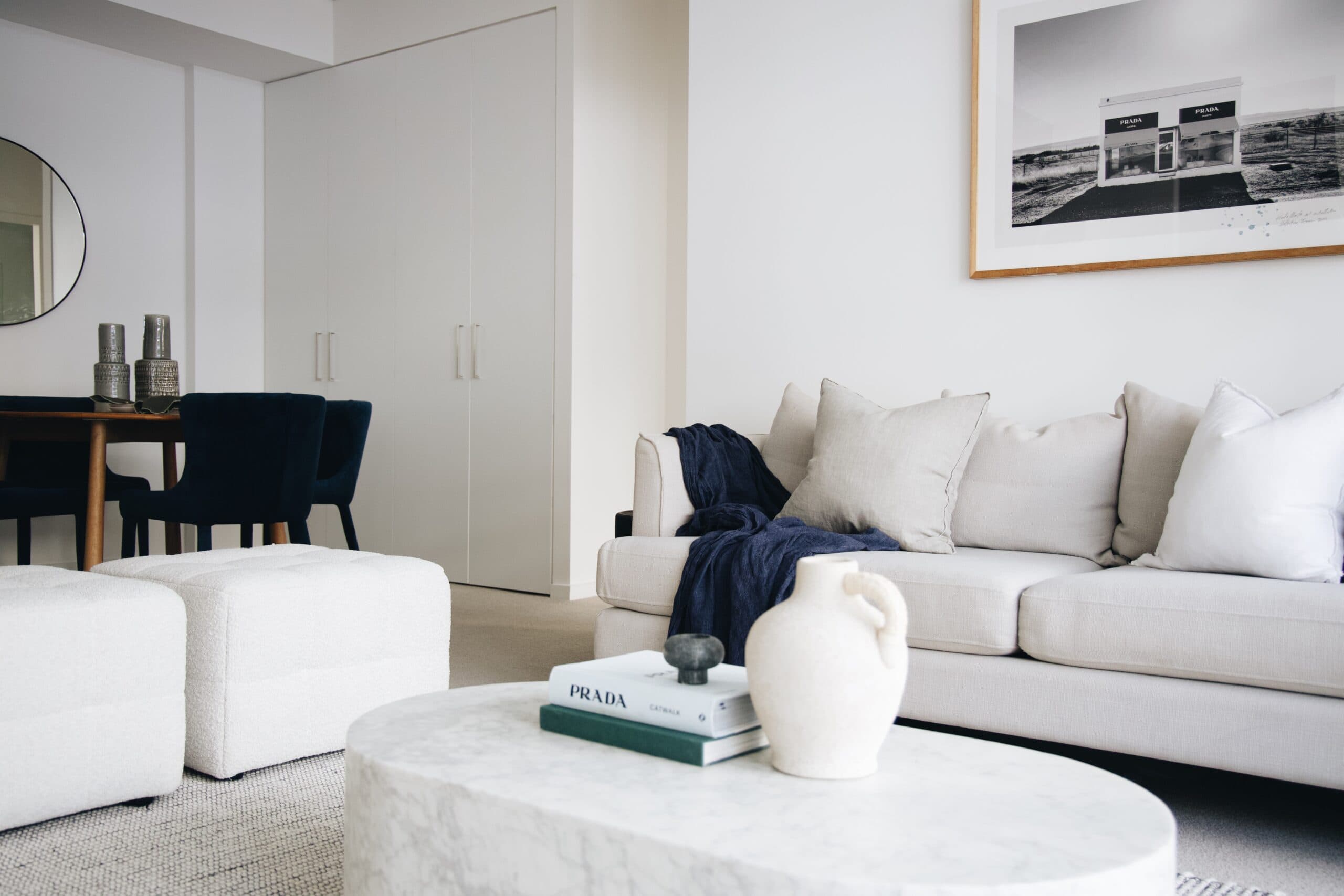
Moody
Bold, deliberate and knowing, Moody adds a touch of contemporary composure to any space. When done right, a moody colour scheme emanates luxury and sophistication. You don’t need to blackout your whole room to capitalise on the moody trend either. Instead, stick with a subtle palette of white and grey tones and opt to add depth through black accents. The trick is all about balance and contrast – too much black and it becomes overwhelmingly bold, too much white and you’ve lost that dark luxurious look you wanted to achieve.